Blogs · 13 Aug 2026 · 13 min
The homepage test: what a stranger understands in four seconds
A stranger has four seconds. Here is the test we run, six homepage patterns we keep marking, and what a directed site makes obvious before the second scroll.

Josip Tomić
Writes the studio notes. Search, agents, and the sites that hold them.
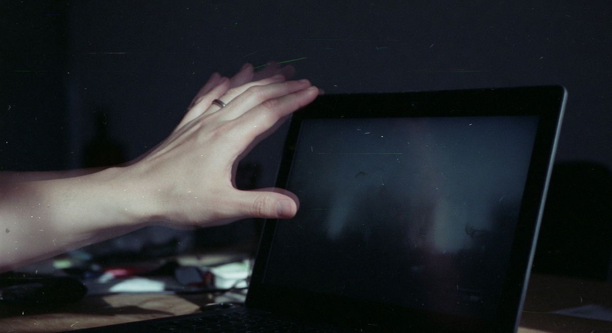
A stranger lands. Four seconds. They should be able to say who you are, what you sell, and what to do next. If they cannot, the homepage is not finished. We close the lid, write three lines, and mark the page with a red pen. Aesthetics decide in milliseconds. Clarity has to land before the first ten.
The lid is already closed.
We do this in the first meeting. The founder has the site on a laptop. They want to walk us through it. We ask them not to. We open the URL, count four, and shut the machine. Then we write what a stranger actually got.
Most of the time the note is cruel and short.
A software company. Something about the future. A button that says Get Started. I do not know what I would start.
That is the whole test.
What is the homepage test?
The homepage test is a first-impression audit. A person who has never met you looks at the first screen for four seconds and answers three questions out loud. Who is this. What do they sell. What should I do.
If those answers need a meeting, the homepage is not doing its job. The rest of the site can be handsome. A homepage that needs a tour is a brochure that forgot the stranger.
We wrote this into the three-line audit years ago. What a stranger understands in four seconds. What we would measure this week. What we would turn off today. The first line is the one founders argue with. They have lived inside the company. They can no longer see the page.
How do we run the four-second test?
We run it on a phone first. Then on a laptop. Same URL. Same four seconds. Different crop.
- Open an incognito window. No logged-in cookies. No “we remember you” banner already dismissed.
- Load the homepage. Start the count when the first meaningful paint is visible, not when the spinner is still arguing with a tag manager.
- Look only at the first screen. Do not scroll. Do not hover. Do not open the menu.
- Close the tab at four seconds.
- Write, in one sentence, who they are, what they sell, and what the next step is.
- Open it again. Now you may scroll. Mark everything that contradicted the sentence.
That is the whole method. It takes six minutes. Do it with someone who has never heard the product name. That person is the only one that counts.
If the three answers change depending on who is holding the phone, the page is speaking in dialect. The homepage has to speak in public.
What should a stranger be able to say after four seconds?
Not a slogan. A sentence a buyer could text to a colleague.
| They should be able to say | They should not have to guess |
|---|---|
| Who you are, in a name they can repeat | Whether this is a product, a studio, or a holding company |
| What you sell, in the buyer’s words | Which of five equally loud offers is the real one |
| Who it is for | Whether they are in the right place |
| What happens if they click the main action | Whether Get Started means a demo, a cart, or a 40-field form |
| What kind of place this is | Whether the brand has a temperature, or only a palette |
The last row is the one agencies skip. Comprehension is not only information. It is atmosphere. A maison and a help desk can both be clear in four seconds. They should not feel like the same room.
On the Eternal maison site we designed the first scroll as a threshold, not a catalogue. Type sits like a caption on a wall. The collection is the light. A stranger does not need the history of 1793 in four seconds. They need to know they have entered rooms, not a grid of SKUs.
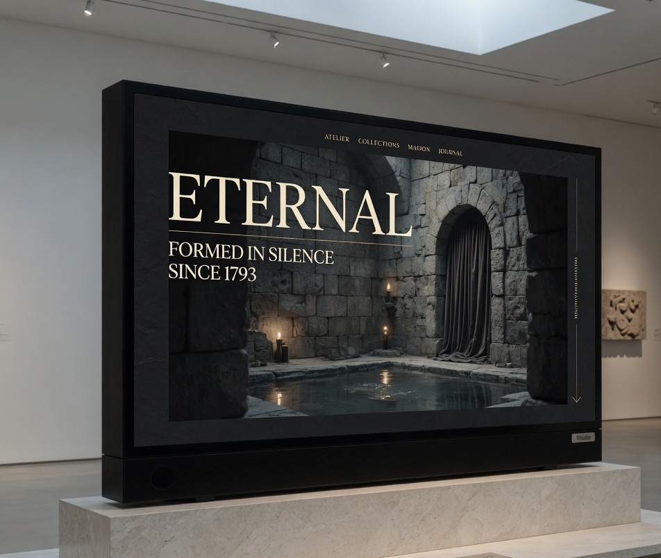
The maison site, on the gallery floor. The first screen is a room, not a catalogue.
Why four seconds and not fifty milliseconds?
Because two clocks are running, and they are not the same clock.
In 2006, Gitte Lindgaard and her colleagues at Carleton showed that people can form a stable judgment of visual appeal in about 50 milliseconds. Nielsen Norman Group later put that in designers’ language: System 1 decides whether the site is beautiful, and the judgment rarely changes if you give people more time. Google’s researchers, on visual complexity and prototypicality, found the aesthetic call in 17 to 50 milliseconds — faster than a blink.
That is the first clock. The room is judged before the headline is read.
The second clock is Jakob Nielsen’s, from Microsoft Research’s dwell-time study: users often leave in 10 to 20 seconds, and the first ten are the harsh ones. Survive that window with a clear value proposition and people may stay for minutes.
Four seconds sits between the two clocks. Long enough to read a line. Short enough that a scroll, a reel, or a founder’s voiceover cannot hide you.
We do not ask the page to be understood in fifty milliseconds. We ask it not to be ugly in fifty, and not to be vague in four.
Nielsen Norman Group’s 5-second test is a close cousin. We tighten it because most homepages now arrive on a phone, between two other tabs. Four is generous.
What homepage patterns fail the test?
We do not name the brands. The patterns have become a typeface of their own. You have seen them this week.
The SaaS cathedral
A dark field. A purple mesh. Three orbs. Inter at billboard size. The headline says The future of work or Build without limits.
There is a product under there. You will not find it in four seconds. You will find a feeling purchased from the same prompt as twelve other tabs.
This is the pattern in why AI-generated websites look like each other. The cathedral is not a company. It is a default. The red pen goes through the headline, then the three equal cards that repeat it, then the ghost button sitting next to the lime one as if indecision were a layout.
The luxury fog
A full-bleed film. Fabric, or stone, or a car in rain. No type for two seconds, then a word in a hairline serif, then the word is gone. The film has audio. On a train, someone else’s film.
Luxury is not fog. Luxury is control. A maison can be slow. It cannot be mute about what it is. “Nothing is explained” is not taste. It is a locked door with a beautiful handle.
The red pen writes one caption under the film. Who. What. The next room.
The agency about the agency
Twelve case studies above the fold, none of them a sentence. A reel of logos. We partner with ambitious brands. The work is below a fold the founder never watches a stranger fail to reach.
The stranger is not hiring a mood. They are trying to see if you have done the kind of thing they need. Put one piece of work on the wall. Caption it. That is how we hang our own work.
The feature museum
Forty-two links in the nav. Product, Platform, Solutions, Resources, Company. Five of those items mean the same thing. The stranger is being asked to do information architecture in four seconds. They will not.
Baymard’s 2025 homepage and navigation benchmark — 16,000 scored elements across 180 large ecommerce sites — found 58 percent of desktop sites and 67 percent of mobile sites mediocre to poor at this job. Participants used the homepage as an anchor. When the anchor is a museum label for every department, they let go.
The red pen circles the nav and writes four words, or we are not ready.
The founder sermon
A letter. A photograph of the founder in linen, looking at a lake. The first screen begins I started this company because I believed.
Belief is not a next step. A sermon can live on an about page. On the homepage it is a person in the door telling you their childhood before they take your coat. The red pen cuts the letter to two sentences and puts the rest behind a name.
The carousel that clicks itself
A hero that rotates. Four campaigns, four offers. The slide the stranger was reading is gone before the thumb arrives. They tap. The wrong page loads.
Baymard’s testers said it out loud. A slide that “changed real fast” is not a feature. Their 2025 review found 46 percent of homepage carousels implemented in a way that causes harm — including the slide that changes a millisecond before the click. Stop the rotation. Keep the one slide that would survive if the other three were deleted.
How do we mark a homepage without redesigning it?
We do not start in Figma. We start on a print of the first screen and write on it.
- Circle the one sentence a stranger can repeat.
- Cross out every sentence they cannot.
- Box the one action we want this week.
- Write the temperature in the margin. Dark. Slow. Gallery. Help desk. If it is blank, the page has a theme, not art direction.
That wall is the brief. Web design that begins without it will produce a prettier version of the same confusion.
The inquiry is the only shared number that does not lie. We wrote that on Monday. The test is how you earn the right to count it.
Why does this still matter if buyers start in ChatGPT?
Because the ones who still arrive, arrive colder and later.
The climate numbers live in you still rank #1 and buyers start in ChatGPT. This page is the first screen.
The homepage is often the last room, not the first. The stranger who still clicks has already been told a version of you by a model. They have four seconds to see whether the building matches.
Princeton’s GEO work — Aggarwal et al., KDD 2024 — found that pages which cite sources, add statistics, and add quotations can lift visibility in generative engines by up to about 40 percent. That is a search job. The homepage job is older. Be the place the citation was about. Google’s own guidance is blunt enough to hang on the wall: write for people. No special markup required. The homepage test is that instruction, applied to a first screen.
What is the studio actually looking at?
Not the font first. That is a later argument, and we have that argument. We look at temperature. Whether the type is a voice. Whether one photograph could only belong to this house. Whether the caption does any work. The button — not the colour, the verb. View the collection is a door. Get started is a shrug.
If something moves, it should be the thing the house is proud of. Not a gradient performing enthusiasm.
If the four-second note is a shrug, you do not need another template. You need someone who will sit with the red pen before they open a file. We wrote a longer note on how to choose a web design studio when a generator will sell you a site for the price of lunch. Ask them what a stranger understands in four seconds. If they answer with a process slide, keep walking.
A directed homepage is a sequence of refusals. One offer. One photograph. One action. Space that is not afraid of being empty. The first screen cannot be delegated to a prompt.
If the sentence is already clean, leave the first screen and go to the things that sabotage it. The popup. The autoplay. The five nav items that mean the same thing. The chatbot that cannot file a ticket. That afternoon has its own red pen.
If the sentence is dirty, we do not add. We cut. Homepages fail because they are written by people who already know.
In June 2026 a designer on r/webdesign asked if anyone else felt weird about the year. The replies were not about tools. They were about what is still sold when the tools can already produce a page.
One comment, from Useful-Advantage-850, is still on our wall.
If all you sell are websites, AI will absolutely replace you. But good designers and writers sell more than just their output. You sell taste, and restraint, and experience, and knowing when to break the rules, and actual understanding of human emotions, and 2 dozen other things AI can’t, and will never do.
The homepage test is restraint, timed.
FAQ
How long should a homepage test take?
The looking takes four seconds. The write-up takes five minutes. If the session lasts an hour, you have started redesigning instead of reading. Do it on a phone and a laptop, with one person who does not work there. Write the three answers. Stop. Anything after that is a different meeting.
Is a 5-second test better than a 4-second test?
No. Nielsen Norman Group’s 5-second test is a sound method, and we use their prompt — anything that comes to mind — when people go quiet. We use four because most arrivals are on a phone, and because four seconds is long enough to read a line and still short enough that a carousel cannot cheat. The number is a discipline, not a finding.
What if our product is complicated?
Then the homepage has to be simpler, not longer. Complicated products fail when they teach the architecture before they name the job. Say the job. Show one proof. Offer one next step. The architecture can live one click later. A stranger will not study a diagram they do not yet trust.
Should the homepage change for ads, search, and AI answers?
The first screen should stay one room. Landing pages can carry a campaign. The homepage has to survive a cold arrival from a model, a colleague, or a brand search. If paid traffic needs a different promise, build the page the ad actually sold. Split those jobs and you get a pretty page no campaign can land on.
Do we need motion to pass the test?
No. Motion is a temperature, not a requirement. If something moves, it should be the thing the house is proud of, and it should not speak unless the visitor asked. A still photograph with a caption will beat a looping orb on any morning we have sat with a stranger.
Can we pass the test with a template?
You can pass comprehension with a template if you write a specific sentence and delete the rest. You cannot pass atmosphere. Templates share a temperature. If the business is a maison, a night line, or a gallery, a shared temperature is a lie. Pass the three answers first. Then look at the room.
What do we send you if we want this done to our site?
Send the live URL and a sentence of what you think the site sells. Do not send the deck. We will run the four-second test on a phone, write the three answers we actually got, and tell you whether the work is a cut, a caption, or a rebuild. Write to us with the URL. We will write back with the note, even if we never work together.
Does the test replace analytics?
No. The test tells you what a stranger understood. Analytics tell you what a crowd did. If the four-second note is a shrug and the bounce is high, believe the stranger. If the note is clean and the inquiry is still quiet, the problem is later — offer, speed, or a thing we would turn off this week.
More from the journal
14 Aug 2026·16 min
YourGPT review: what it does after the demo
A practitioner review of YourGPT — what the agent platform actually is, what the plans cost, where it fails, and when we would not install it.
Josip Tomić
Partner
13 Aug 2026·12 min
You still rank #1. The visits are gone. Now what
You still rank number one. The visits are gone. A diagnostic for algorithm hits, AI Overviews that ate the click, and pages that never converted.
Josip Tomić
Partner