Blogs · 13 Aug 2026 · 13 min
Why AI-generated websites look like each other — and how a directed site refuses
AI builders default to Inter, orbs, and three cards. Type pairing, one photograph, space, and a caption are how a directed site refuses the template.

Josip Tomić
Partner
Partner at Simplex. He leads the AI agent work on YourGPT — the knowledge, the functions, and the site the agent sits on — and writes the studio reviews.
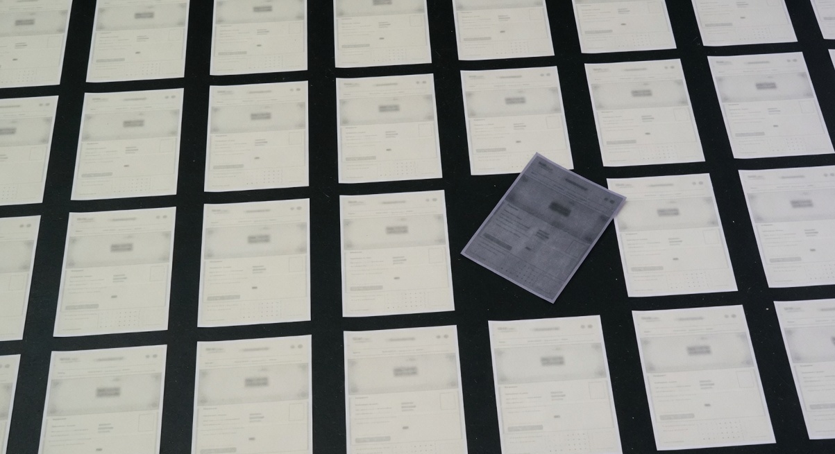
They look the same because the tools share a mean. Inter. A purple mesh. Three equal cards. An orb that thinks it is light. A directed site refuses those defaults on purpose: a type pairing, one photograph that could only belong to this house, space that is allowed to be empty, and a caption under the image.
Open twelve tabs. Do not read them. Squint.
You will see the same evening. A dark field trying to be expensive. A gradient that was born in a prompt. A headline set in Inter, or in a cousin of Inter that has not yet admitted it. Three cards, equal, with icons that came from the same pack. A button that says Get started. A second button that says nothing, politely.
The companies are different. The rooms are not. Generators are fast. Fast is useful. A mean is not a brand, and the web is currently being rebuilt as a mean.
Why do AI-generated websites look the same?
Because the model is asked to produce “a modern website,” and modern, in the training set, is a pile of the same pages.
The pile has a typeface. It has a radius. It has a hero. It has a mesh. It has a sentence about the future that could be bolted onto a bank, a CRM, or a candle company without changing a word.
A generator does not decide. It averages. Ask for a site and refuse nothing, and you receive the average, rendered at a very high resolution.
Sameness is not a style. It is what happens when nobody is in the room to say no.
In June 2026 a designer on r/webdesign asked if anyone else felt weird about the year. The thread is about the moment the output became cheaper than the judgment.
Useful-Advantage-850 wrote the line we keep. Good designers do not sell a page. They sell taste, restraint, and knowing when to break the rule. The generator will give you the rule, polished. It will not tell you which rule to break.
That is the whole essay. The rest is the inventory.
What are the defaults?
Name them. If you cannot name them, you will ship them.
| Default | What it is doing | What a stranger reads |
|---|---|---|
| Inter, at the default tracking | A screen typeface doing the job of a voice | Anyone could have made this |
| Purple mesh / blue orb | Atmosphere purchased from a prompt | Software, even if you sell rooms |
| Three equal cards | A layout that refuses to choose | Three things of equal unimportance |
| 8-point radius on every box | A component library, not a house | SaaS, regardless of the photograph |
| The future of X | A headline that will not be sued | Nothing I can repeat to a colleague |
| Ghost button next to the real one | A fear of commitment | I do not know which door is the door |
| Stock hands on a laptop | A photograph of “business” | I have already left |
Inter is not the villain. Inter was drawn by Rasmus Andersson to be a screen face with a large x-height and honest italics. It reads. It is also the default in half the builders, half the component kits, and nearly every “make me a landing page” prompt. A default, used as a default, is a confession.
The mesh is not light. Light has a source. A candle has a source. A gallery window has a source. A mesh is a texture that was cheap to generate and expensive to forget.
The three cards are the most honest object on the page. They tell you the team could not decide what mattered, so they made three things the same size and hoped the grid would look like a strategy.
Google’s researchers, writing in 2012, found that people prefer sites that look both simple and familiar — low visual complexity, high prototypicality — and they form that judgment in 17 to 50 milliseconds. The generator learned the familiar part too well. Familiar is now the mesh. Familiar is now Inter at 72px with tracking the file never touched.
Lindgaard’s 2006 study put the same clock in the literature: visual appeal can be assessed in about 50 milliseconds. Nielsen Norman Group, translating that for practitioners, noted the judgment rarely changes if you give people more time.
A stranger does not need four seconds to know they have seen this room. They need one glance. The homepage test is what you do after that glance, to find out whether anything specific survived.
How does a directed site refuse?
It refuses one thing at a time. Not a rebrand. A sequence of no.
Type pairing, not a default
One face for the voice. One face for the work. Not a third. Not a variable font doing impressions.
A pairing is a decision about temperature. A serif that sits like a caption on a wall, next to a sans that can carry a price and a nav, is a house. Inter next to Inter Italic is a file.
We do not publish the pairing here as a recipe. Recipes become defaults. The test is whether a stranger, squinting, can tell this type from the last tab. If they cannot, you have not paired anything. You have installed a font.
On our own work, type is small until it has a reason to be large. Large type that has nothing to say is the cathedral again.
One photograph
Not a set. Not a reel. One.
The photograph has to be able to fail a lineup. If you cover the logo and the picture could still be a bank, a SaaS, or a hotel in Lisbon, it is not a photograph. It is furniture.
For Eternal the first image is a room. Stone. Candlelight. The line about 1793 comes later, as a caption, not as a headline trying to do the image’s job. Collectors do not need a hero of “lifestyle.” They need to feel the threshold.
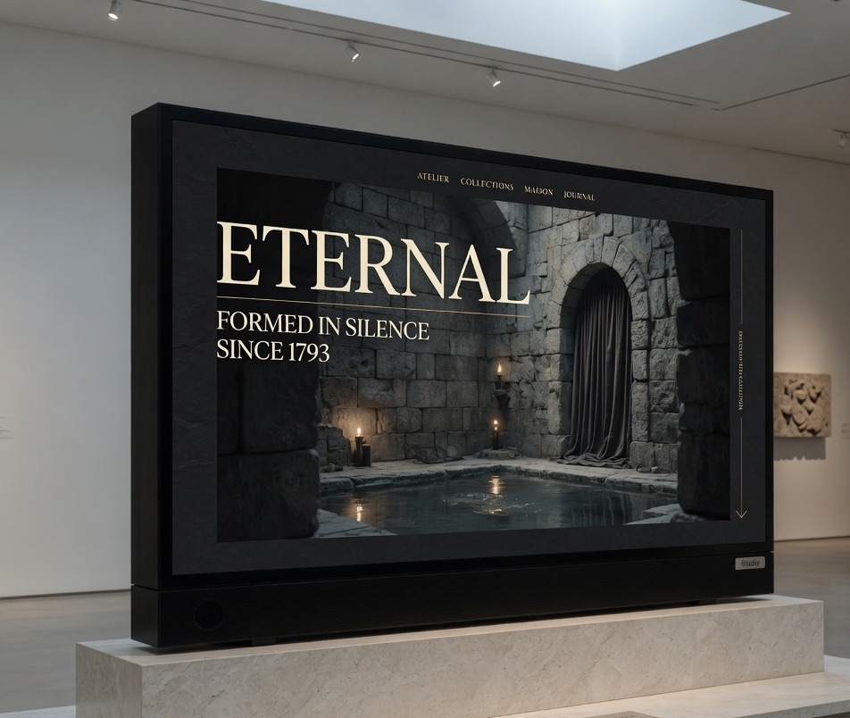
The maison site, on the gallery floor. One picture. A caption. Nothing moving that should not.
Stock hands on a laptop are the photograph equivalent of Inter. They are not wrong. They are ownerless.
Space that is allowed to be empty
The generator is afraid of quiet. Quiet looks like a mistake to a model that has been rewarded for filling the frame.
A directed site leaves a wall. The wall is not wasted. It is how the one photograph is allowed to be one photograph. It is how the type is allowed to sit like a caption instead of a billboard.
If every increment of the scroll introduces a new object, the page is talking over itself.
Baymard’s testers, on homepages stuffed with offers, said the quiet part: “There’s so much going on.” Their 2025 review found 55 percent of sites using aggressive ads, pop-up banners, or overlay sign-ups on the homepage — and the reaction was disdain, not conversion. Space is not a luxury choice. It is how a stranger is permitted to see.
A caption under the image
This is the refusal most teams skip. They will change the type. They will commission the photograph. They will still let the picture sit mute, like a mood board that escaped.
On Simplex Work, every picture has a line under it. Not an alt tag pretending to be a sentence. A caption. The maison site, on the gallery floor. Live tickets, with the agent already in the thread. After close: the call, and the log.
The caption does three jobs. It tells you what you are looking at. It tells you the temperature of the studio. It tells a model, and a stranger, that a person stood in the room and named the thing.
Google’s 2026 guidance on generative features is not a prompt trick. It is write for people. Non-commodity content. A point of view. High-quality images that belong to the page. A caption is that instruction, applied to a picture.
Princeton’s GEO paper — Aggarwal et al., KDD 2024 — found that citations, statistics, and quotations can lift visibility in generative engines by up to about 40 percent. A caption is a quotation you write yourself, under the only evidence you have.
What does “directed” actually mean?
It means someone sat in the room and refused the mean.
Direction is not a mood board. It is a list of things the site will not do. We will not use the mesh. We will not set the voice in the default. We will not run three offers at the same size. We will not autoplay. We will not ask for an email before we have shown a room.
The list is the brief. Web design that begins without a list of refusals will produce a prettier version of the eleven other tabs.
On Eternal, the last site had been a catalogue with a serif on top. Collectors left before they felt anything. We did not add a reel. We designed a sequence of rooms. Nothing moves unless it should. The first impression had to be as considered as the work inside.
That is direction. It is slower than a prompt. It is also the only reason to hire a studio when a generator will sell you a site for the price of lunch. We wrote the buying question down in how to choose a web design studio. Ask them what they would refuse. If they answer with a process slide, keep walking.
Is this just taste, or does it convert?
Both. They are not different jobs.
Jakob Nielsen, reading Microsoft Research’s dwell-time study, put the commercial clock on the table: users often leave in 10 to 20 seconds. The first ten are the harsh ones. A page that survives with a clear value proposition may keep people for minutes. A page that looks like the last eleven tabs does not get the ten.
If you need the click-and-citation climate, it is written in you still rank #1. This page is about the picture.
If the building looks like a template, they will not stay to correct the model. They will go back to the tab that already answered.
A directed site is the correction. It is also the only page worth ranking. Semrush’s study of 200,000 AI Overviews found 82 percent of desktop AIOs on keywords with fewer than 1,000 monthly searches, and 35 percent of those queries were questions. Questions want a specific room, not a mesh.
Do we have to throw out the generator?
No. We have to stop letting it choose.
Use it to draft a layout you will then ruin on purpose. Use it to set type you will then recut. Use it to write five headlines you will then delete four of. The tool is a junior who works nights and has no taste. That is useful. It is not a director.
The stack is a separate argument. We wrote Next.js vs Webflow vs Framer for the brand-site question. The short version: pick the one that will still let you refuse. If the builder will not let you set a caption under an image, or pair type without a marketplace kit, you have hired a mean.
On Eternal we built in Next.js so the first impression could be as considered as the rooms. That is not a framework religion. It is control. Control is the opposite of a default.
What should we refuse this week, without a rebuild?
Four things. They do not need a new CMS.
- Change the type pairing. One voice, one work face. Touch the tracking. If it still looks like the last tab, you chose the wrong pair.
- Kill two of the three cards. The remaining card is the offer. If you cannot kill two, you do not have an offer. You have a menu.
- Replace the mesh with one photograph. Crop it until it could fail a lineup.
- Write a caption. One line. What we are looking at, and where.
Then run the homepage test. Four seconds. Who. What. Next. If the stranger still says “a software company, something about the future,” you have not refused enough.
The rest of the sabotage — popups, autoplay, a chatbot that cannot file a ticket — is a different red pen. Cut the sameness first.
What does the studio hang on the wall?
A print of the first screen. The caption written under it in pencil. A list of refusals in the margin.
We do not start with a component kit. We start with the room. Dark, slow, exact — when the house is a maison. Bright and spare when the house is a desk. The temperature is not a trend. It is a decision about who is walking in.
If you want that decision made on your site, send the live URL and one photograph you already own. Not a mood board. A picture from the work. We will tell you whether the site is currently a room, or a mean. Write to us with the URL and the picture. We will write back with the refusals, even if we never open a file.
FAQ
Why do so many AI websites use Inter?
Because Inter is a competent screen face and it is the default in the tools. Rasmus Andersson drew it to read at small sizes, not to be a brand voice. When a builder, a kit, and a prompt all start from Inter, the internet inherits one temperature. The typeface is not the failure. Using it without a pairing, at the default tracking, as the only voice on the page, is the failure.
Is purple mesh actually a default, or just a joke?
It is a default. Generators trained on a decade of “modern SaaS” heroes reproduce the mesh, the orb, and the blue-to-violet field because those images dominate the set. A joke that ships on paying sites is no longer a joke. If your house is not software, the mesh is a costume.
Can a template ever look directed?
It can look clear. Clarity is a sentence and a next step. Direction is a temperature that could only belong to this house. A template can carry the sentence. It will struggle with the temperature, because the temperature is made of refusals the template was not paid to make. Pass the homepage test first. Then decide whether the room still looks like everyone else’s.
Do we need custom photography?
You need one picture that can fail a lineup. Sometimes that is a commissioned frame. Sometimes it is a photograph the founder already has, cropped until the laptop and the plant are gone. Custom is not the point. Ownership is. If the picture could sell a different company with a logo swap, it is still stock.
Will a directed site hurt SEO?
Not if it is specific. Google’s guidance for generative features is people-first, non-commodity content — no special AI markup required. A caption, a point of view, and a photograph that belongs to the page are closer to that brief than a mesh with three cards. Sameness is the commodity. Direction is the thing a model can actually cite.
How do we brief a studio so we do not get the mean back?
Send the live site, one photograph, and a list of things you will not do. Ask what they would refuse. Ask what a stranger understands in four seconds. If the reply is a process slide or a mood of “bold and minimal,” you are about to buy the eleven other tabs. The longer version is in how to choose a web design studio.
What stack do you use when the site has to refuse defaults?
The one that still lets us write a caption, pair type, and keep the first paint honest. For brand sites that need that control we often build in Next.js — see Next.js vs Webflow vs Framer. The stack is not the art direction. The stack is whether the art direction survives contact with production.
More from the journal
14 Aug 2026·19 min
YourGPT review: what it does after the demo
A practitioner review of YourGPT — what the agent platform actually is, what the plans cost, where it fails, and when we would not install it.
Josip Tomić
Partner
13 Aug 2026·12 min
You still rank #1. The visits are gone. Now what
You still rank number one. The visits are gone. A diagnostic for algorithm hits, AI Overviews that ate the click, and pages that never converted.
Kavya Iyer
Content lead